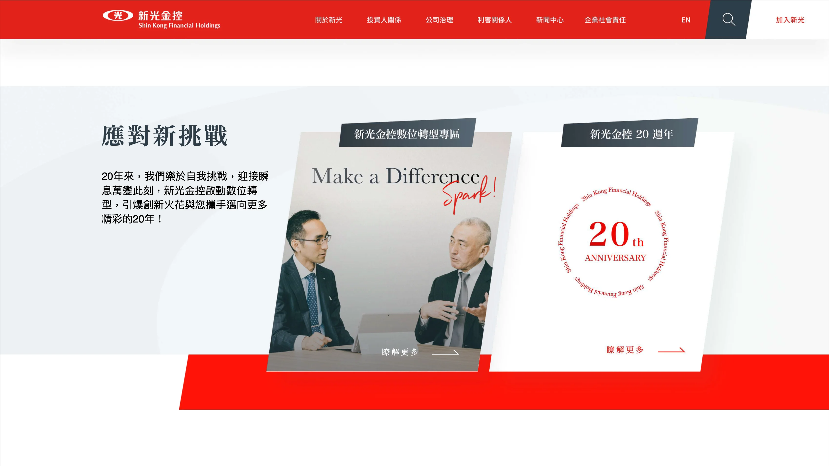
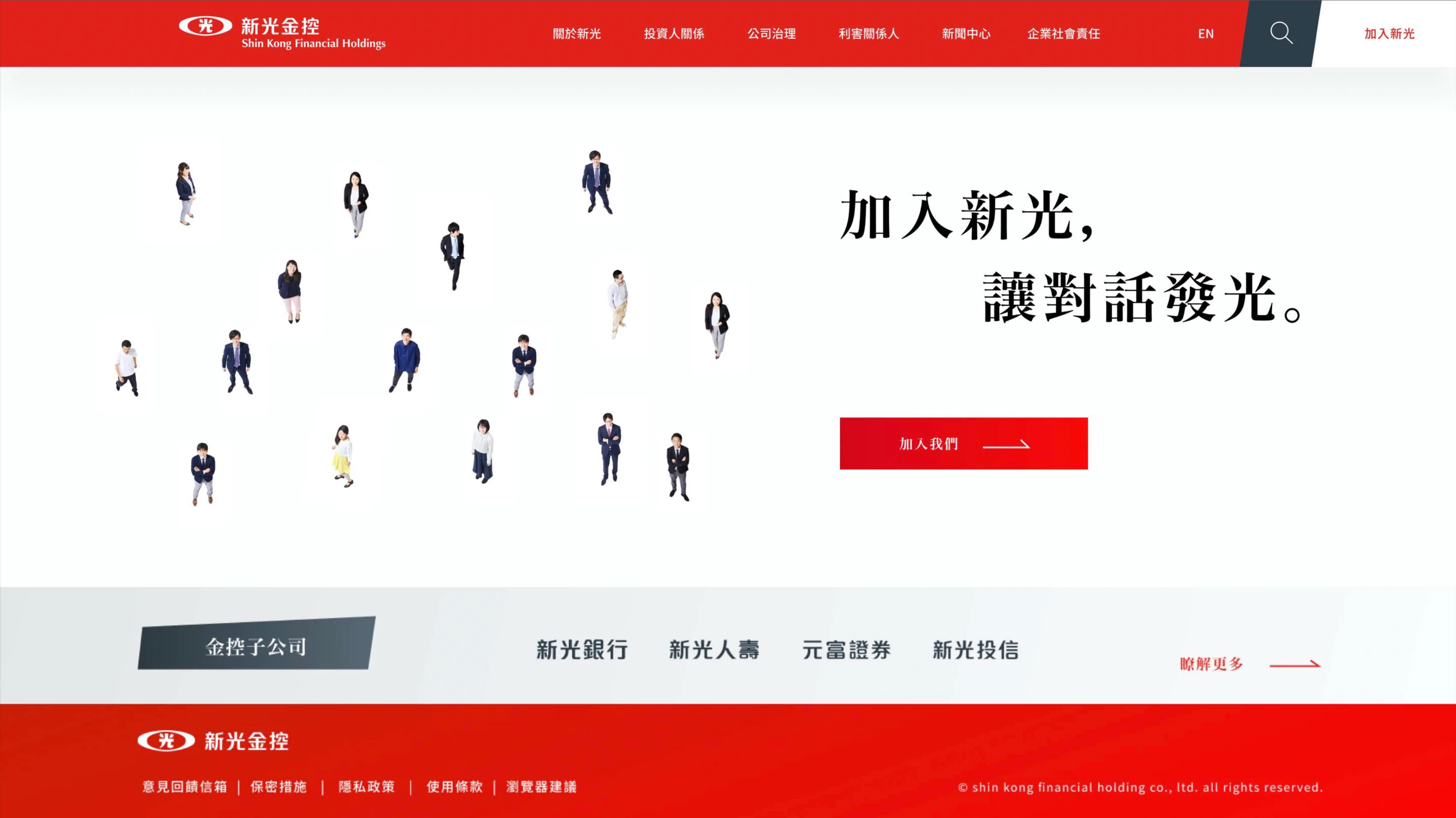
SKFH official website
As Shin Kong Financial Holding prepares to celebrate its 20th anniversary milestone, it also aims to embrace the post-pandemic era and the new challenges of digital transformation in the financial industry.Therefore, it has decided to build on the solid foundation of its existing brand and incorporate more unique elements that belong to Shin Kong Financial Holding.This will enrich the spirit of the existing brand and create a new official website to establish a fresh brand image as it moves forward into the next 20 years.
.webp)
Stakeholder interview
Different departments and different generations
When designing the new website, it is important to understand the current usage context and pain points of each department within the financial holding company. This will allow us to create a design that effectively supports their daily work and enables them to communicate important information to the media, investors, customers and other target users.
In addition, as SKFH is in a period of generational change, with new and old managers working together, it is important to recognise that they may have different perspectives on the desired image and values of the company. Therefore, gathering their ideas, organising them and finding common ground will be crucial in creating a corporate image and spirit that both generations of leaders can embrace.
In addition, as SKFH is in a period of generational change, with new and old managers working together, it is important to recognise that they may have different perspectives on the desired image and values of the company. Therefore, gathering their ideas, organising them and finding common ground will be crucial in creating a corporate image and spirit that both generations of leaders can embrace.


Activities
Branding Reaction Card
Enhance the existing brand spirit of Shin Kong Financial Holding by identifying the brand personality from the Brand reaction card, in order to align with the strategy of "digital transformation"
(estimated duration: 30 minutes).
(estimated duration: 30 minutes).
In-depth interviewing
Engage in an in-depth conversation to explore various aspects of brand image and website redesign
(estimated time: 30 minutes).
(estimated time: 30 minutes).


Design concept
Design goal
Building on SKFH's brand spirit, create a brand narrative that is "compelling and relatable", enabling SKFH to evoke a "natural and positive" brand association in customers' minds in terms of their experience, transformation, innovation and sustainability. This will create a deep brand identity and preference.
Dialogue of Shin Kong
Shin Kong nurtures the spirit of preserving the brand's traditional characteristics while embracing the Spark concept of passing on the torch. By engaging in inclusive and open dialogues, we aim to foster diverse communication that creates resonance.
"Inter-generational dialogue, enriching and inheriting Shin Kong's excellent traditions, cross-domain dialogue, breaking boundaries for creative collisions, creating a better customer experience through these dialogues."


Optimization

Navigation
An additional level of design in the navigation system that allows for clear visibility of the site's content structure, reducing the time spent searching for information. Users can easily move to other pages at any time using the navigation system.
Reorganization of categories
・Reorganise the category structure of 'Important Information', 'Internal Management', 'Other', etc. to make the content easily visible and effectively understood and accessed.
・Organise and categorise scattered PDF documents into a centralised page for easy access and download.
・Organise and categorise scattered PDF documents into a centralised page for easy access and download.


Extracting key content points
Prominently display real-time information such as 'Monthly Operational Status' and 'Latest News' on the home page, with clear navigation to the relevant pages, making it easier for users to access detailed information.
Design System
Since the new SKFH's website will be the first to showcase a fresh new look for its 20th anniversary. all other corporate websites within the group will adopt a consistent style based on the revamped image of the new SKFH's website. Therefore, we need to establish a clear design system for the entire brand to ensure a consistent digital experience across the group.
Image
We envision the Shin Kong Group's overall brand image to be 'positive', 'bright' and 'warm', with a presence of light and metaphorical elements. When we focus on images of individuals, they should embody qualities such as 'energetic', 'hopeful' and 'warm and caring' that are consistent with these descriptions.
The light shown in the images varies in tone, with different hues and colour temperatures between sunrise and sunset. To maintain a consistent tonality of light in the images, it is recommended that you refer to the numerical range between 10:00 AM and 4:00 PM, as shown in the top right image, to adjust the colour temperature and hue.
The light shown in the images varies in tone, with different hues and colour temperatures between sunrise and sunset. To maintain a consistent tonality of light in the images, it is recommended that you refer to the numerical range between 10:00 AM and 4:00 PM, as shown in the top right image, to adjust the colour temperature and hue.

Color guidelines
Maintaining the brand's high recognition through colour definition, retaining its iconic representation and incorporating a dark grey accent to improve legibility and highlight the brand colour in text. The complementary grey palette is used to add depth and maintain colour consistency.
Based on the brand colour and accent colour, different gradient versions of the styles are created to add visual depth and reinforce the brand's visual identity. These gradients can be used as backgrounds or sections, effectively guiding the browsing flow.
Based on the brand colour and accent colour, different gradient versions of the styles are created to add visual depth and reinforce the brand's visual identity. These gradients can be used as backgrounds or sections, effectively guiding the browsing flow.

Copywriting
In terms of writing style, it must be consistent with the core value of 'dialogue', avoiding flashy, boastful or authoritative writing styles and aiming for two-way, equal communication. The overall tone should express the guiding principles of 'confident equality', 'warm and personable' and 'positive and upbeat'.

Graphics
By using techniques such as partial enlargement, rotation, duplication, fading and colour stacking, the New Kinpo logo can be used to create auxiliary graphics suitable for block backgrounds. Different angles and orientations can be applied to these auxiliary graphics, and the use of broken frames is appropriate when placing them within blocks. In addition, it is important to avoid visual colour confusion by not overlapping colour blocks of different colour schemes in the auxiliary graphics themselves or when reusing them.
Auxiliary graphics are mainly used as backgrounds, to highlight text and to complement photos.
Auxiliary graphics are mainly used as backgrounds, to highlight text and to complement photos.

Reflection
The key task of this project is to help Shin Kong reach an internal consensus on the brand image. It is important to understand that managers from different generations within the new Shin Kong have very different perceptions of the desired image based on their past experiences, encounters with Shin Kong, and backgrounds.
Therefore, we need to carefully analyse and summarise each piece of information they provide. Some messages may appear different on the surface, but their core values are consistent. Some messages may contain contradictions, so we need to systematically unravel these contradictions and identify the underlying context in each message.
This approach will help us to create a core concept that will win over everyone and break down barriers between leaders of different generations. We will build consensus and communicate this core concept to users through the use of colour, interactivity, writing tone, visual style, and other design elements.

